The Role of Aesthetics in Boutique Visiting Cards: Top Design Ideas
The Role of Aesthetics in Boutique Visiting Cards: Top Design Ideas
In the realm of fashion and retail, aesthetics are paramount. A boutique's visiting card is not just a piece of paper; it's a canvas for creativity, a reflection of your brand's identity, and a powerful tool for making a lasting impression. The aesthetics of your visiting card can set the tone for your boutique and play a significant role in building brand recognition. In this blog, we will explore the crucial role that aesthetics play in boutique visiting cards and provide top design ideas to enhance the visual appeal and creative branding of your cards.
The Significance of Aesthetics in Boutique Visiting Cards
Boutique visiting cards are more than just contact information; they are a direct representation of your boutique's style, personality, and overall aesthetic. Here's why aesthetics matter:
- First Impressions: Your visiting card is often the first impression potential customers have of your boutique. Aesthetic appeal sets the stage for this initial interaction.
- Brand Identity: The aesthetics of your card should align with your boutique's brand identity, reflecting its unique style, values, and offerings.
- Memorability: An aesthetically pleasing card is more likely to be retained and remembered by clients, making them more likely to revisit your boutique.
- Differentiation: In a competitive market, a well-designed visiting card sets your boutique apart from others and leaves a lasting impression.
Now, let's delve into top design ideas that can help you infuse your boutique's visiting card with the right aesthetics to enhance visual appeal and creative branding.
- Embrace Minimalism
Minimalism has become a timeless and versatile design trend. When applied to your boutique's visiting card, it can create an elegant and sophisticated look.
Technique: Use a simple color palette with neutral or monochromatic tones. Incorporate clean lines and minimalistic fonts. Place essential information and your logo in a clean layout.
Advice: Minimalism can be a powerful tool to convey a sense of luxury and high-end appeal. Less is often more when it comes to this design approach.
- Vibrant and Playful Colors
If your boutique has a vibrant and playful personality, don't shy away from bold colors.
Technique: Use a lively color palette with bright and contrasting colors. Create visual interest with color blocking or gradients. Experiment with playful fonts.
Advice: Bold colors can evoke emotions and make your card stand out. Ensure that your color choices align with your boutique's brand identity and message.
- Vintage and Nostalgic Elements
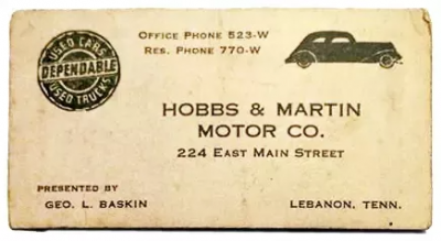
Vintage aesthetics can bring a sense of nostalgia and timelessness to your boutique's visiting card.
Technique: Incorporate vintage elements like sepia-toned images, ornate patterns, and retro fonts. Consider using aged or textured paper for an authentic vintage feel.
Advice: Vintage aesthetics work exceptionally well for boutiques with a retro or classic fashion style.
- Artistic and Hand-Drawn Designs
If your boutique embraces artistic and creative styles, consider hand-drawn or artistic elements in the design.
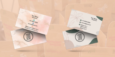
Technique: Integrate hand-drawn illustrations, sketches, or watercolour elements. Use expressive and artistic fonts to add a personalized touch.
Advice: Hand-drawn designs can make your card unique and reflect a sense of artistic craftsmanship, ideal for boutiques that sell handmade or artistic products.
- Geometric Patterns
Geometric patterns can create a visually striking and modern appeal for your boutique's visiting card.
Technique: Experiment with geometric shapes, patterns, and symmetrical designs. Use bold lines and angles to create a sense of order and structure.
Advice: Geometric designs can convey a contemporary and avant-garde style. They work well for boutiques with a modern or architectural influence.
- Floral and Nature-inspired Themes
For boutiques with a natural or organic focus, floral and nature-inspired themes can add a touch of elegance.
Technique: Incorporate floral illustrations, botanical patterns, or images of natural elements. Use soft and organic color palettes.
Advice: Nature-inspired themes are perfect for boutiques that sell organic, eco-friendly, or nature-related products.
- Luxury and High-End Appeal
If your boutique targets a high-end market, your visiting card should exude luxury and sophistication.
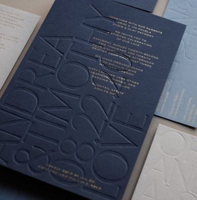
Technique: Use rich and opulent colors like deep purples, gold, or silver. Opt for elegant fonts and consider embellishments like foiling or embossing.
Advice: Luxury aesthetics should be consistent with the premium nature of your boutique's offerings.
- Whimsical and Playful Styles
Boutiques with a playful and whimsical style can incorporate fun design elements.
Technique: Use quirky and whimsical fonts. Include playful illustrations or characters that reflect your boutique's personality.
Advice: Whimsical styles are perfect for boutiques that cater to children's clothing, novelty items, or playful fashion.
- High-Quality Imagery
When visuals are essential to your boutique's offerings, high-quality imagery is key.
Technique: Use stunning images of your products or model photos showcasing your fashion collections. Ensure the images are high-resolution and well-lit.
Advice: High-quality imagery helps clients understand your boutique's style and offerings at a glance.
- Custom Die-Cut Shapes
Custom die-cut shapes can make your visiting card visually interesting and unique.
Technique: Experiment with custom shapes that align with your brand identity. For example, if your boutique specializes in women's clothing, a silhouette of a woman's figure can be a striking design.
Advice: Custom die-cut shapes can add a tactile element and enhance the visual appeal of your card.
- Use Textures for Depth
Textures can add depth and tactility to your card, making it more visually engaging.
Technique: Incorporate textured backgrounds, such as linen or canvas patterns. Consider spot UV coating for specific areas to create contrasting textures.
Advice: The use of textures can evoke sensory appeal and create a multi-dimensional experience.


