The Power of First Impressions: Crafting an Authentic Jyotish Astrology Visiting Card
The Power of First Impressions: Crafting an Authentic Jyotish Astrology Visiting Card
In the realm of Jyotish astrology, where ancient wisdom meets modern curiosity, the first impression often holds profound significance. The authenticity and trustworthiness of a Jyotish astrologer are established within seconds of the initial encounter. While personal skills and expertise are vital, an impactful Jyotish astrology visiting card can play a crucial role in making that all-important first impression. In this blog, we'll explore the art of crafting an authentic Jyotish astrology business card that reflects your expertise and the power of the stars.
Creating an Impactful Jyotish Astrology Business Card
The business card is more than just a piece of paper; it's a tangible representation of your identity as a Jyotish astrologer. It's a bridge between the ethereal world of astrology and the practical world of clients and seekers. An impactful Jyotish astrology business card should capture your essence, communicate your expertise, and leave a lasting impression. Here's how to achieve that:
- Balance Tradition and Modernity: Jyotish astrology has deep roots in tradition and ancient wisdom. Your business card should strike a balance between traditional and modern design aesthetics. Use traditional symbols or imagery but present them in a contemporary and professional manner.
- Quality Paper and Printing: Invest in high-quality paper and professional printing. The texture and finish of the card should reflect the importance and seriousness of your work. Clients will appreciate the care and attention to detail that goes into a well-crafted card.
- Clear and Legible Fonts: Use fonts that are easy to read. While artistic calligraphy may be appealing, readability should be a top priority. The text on your card should be easily understood, as clarity reflects professionalism.
- Incorporate Your Brand Colors: If you have specific brand colors associated with your astrology practice, incorporate them into the card's design. Consistency in color schemes strengthens brand recognition.
- Symbolism and Imagery: Consider incorporating symbols or imagery associated with Jyotish astrology. A representation of the celestial bodies or astrological symbols can serve as visual cues to your specialization.
- Brief Introduction: A concise introduction or tagline can provide a glimpse of your expertise. For example, "Jyotish Astrologer: Guiding Lives through the Stars." This adds context to your practice.
- Contact Information: Include your name, phone number, email address, and any relevant social media profiles. Ensure that this information is current and accurate.
- QR Code: A QR code can link to your website or a portfolio of your work, making it convenient for clients to access more information about your practice.
- Client Testimonials: If you've received positive feedback from clients, consider including a brief testimonial on the back of your card. Genuine testimonials can enhance your credibility.
- Professional Photo: Including a professional headshot on your card humanizes your practice and creates a personal connection with potential clients. It adds a face to the expertise.
- Laminated Finish: A laminated finish not only adds a touch of elegance but also ensures the durability of your cards, keeping them pristine and professional.
Designing a Memorable Jyotish Astrology Visiting Card
The design of your Jyotish astrology visiting card should be carefully thought out to ensure that it leaves a lasting and memorable impression. Here are some design tips to help you create a card that resonates with your clients and seekers:
- Simplicity: A cluttered design can overwhelm and distract from your message. Keep the design simple and focused on the essential elements, allowing the viewer to absorb the information easily.
- Aesthetic Symmetry: A balanced and symmetrical design is visually appealing. It provides a sense of harmony and order, which can be reflective of the order and precision inherent in astrology.
- Use of Space: Utilize both sides of the card effectively. The front can have your name, title, and contact information, while the back can include a brief bio, testimonials, or a QR code linking to your website.
- Colors with Purpose: The color palette you choose should align with the emotions and feelings you want to evoke. Blues and purples, for example, are often associated with spirituality and intuition.
- Celestial Elements: Incorporate celestial elements, such as stars, planets, or constellations, into the design to reinforce the connection to astrology.
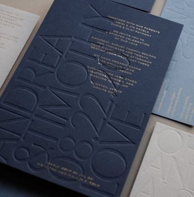
- Texture and Finish: Consider using textured paper or embossed elements to add a tactile dimension to your card. This creates a sense of depth and substance.
- Typography: Choose fonts that evoke a sense of wisdom and mystique. Script or calligraphic fonts can be a good choice, but ensure they remain legible.
- Size and Shape: While standard business card dimensions are typical, you may consider a square or custom shape to make your card stand out. Ensure it still fits comfortably in standard cardholders.
- Authenticity: Your card should authentically represent your approach to Jyotish astrology. The design should be in alignment with your style and the services you offer.
- Leverage Negative Space: Allow for some "breathing room" on your card. Negative space can be as powerful as the visual elements themselves, making the card feel less cluttered and more elegant.


