Toggle Nav

The Dos and Don'ts of Designing a Travel Agent's Business Card

The Dos and Don'ts of Designing a Travel Agent's Business Card

In the vibrant world of travel and tourism, travel agents play a pivotal role in turning travel dreams into reality. Whether it's crafting bespoke itineraries for a luxury escape or helping adventurers explore hidden gems, travel agents are the bridge between wanderlust and unforgettable experiences. An effective tool for travel agents to make a lasting impression is a well-designed business card. The design of your travel agent business card can significantly influence your first impression and your ability to attract new clients. In this blog, we'll explore the dos and don'ts of designing a travel agent's business card that helps you stand out in the travel industry.
The Significance of a Travel Agent's Business Card
Why is a business card important for a travel agent? Here's why:
- First Impressions: A well-crafted business card is often the first point of contact between you and a potential client. It sets the stage for the initial impression, which can determine whether someone chooses your services.
- Tangible Representation: Your business card serves as a tangible representation of your brand and services. The design, content, and imagery can communicate the essence of your travel agency and the quality of the travel experiences you offer.
- Memorability: A memorable and well-designed card is more likely to be remembered by travelers who are exploring various travel options. It increases the chances of potential clients reaching out to you when they plan their next adventure.
- Marketing Tool: Beyond contact information, your business card can serve as a marketing tool. It's an opportunity to showcase your brand's logo, tagline, featured destinations, and special promotions. It's an effective way to market your travel services.
- Networking: In an industry that thrives on relationships and collaborations with various travel-related businesses, your business card facilitates interactions with potential clients, partners, suppliers, and industry professionals. It's a powerful networking tool.
Now, let's delve into the dos and don'ts of designing a travel agent's business card.
The Dos
- Keep It Simple and Clean

Do: Simplicity is key. A clean and uncluttered design makes your card visually appealing and easy to read. It should convey professionalism and simplicity, reflecting the ease and relaxation of a perfect vacation.
Don't: Avoid overcrowding the card with excessive text or images. Cluttered cards can overwhelm potential clients.
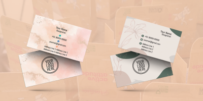
- Use High-Quality Imagery
Do: Utilize high-quality and captivating images of travel destinations on your card. Visuals are powerful in the travel industry, and your images should evoke wanderlust and the desire to explore.
Don't: Don't use low-quality or pixelated images. Poor visuals can diminish the appeal of your card and your travel agency.
- Maintain Brand Consistency
Do: Ensure that your business card design aligns with your brand's colors, fonts, and logo. Consistency reinforces your agency's identity and makes your card more recognizable.
Don't: Avoid using design elements or colors that conflict with your brand's established identity. Consistency is essential in branding.
- Feature Your Logo Prominently

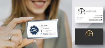
Do: Your travel agency's logo should be featured prominently on the card. It's an emblem of your brand and should be instantly associated with your travel services.
Don't: Don't place your logo in an inconspicuous location or make it too small. Your logo should be easily recognizable.
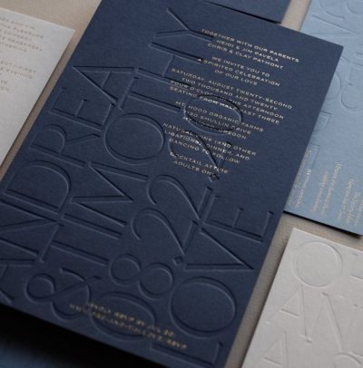
- Choose Readable Typography
Do: Select clear, readable fonts for your contact information. The typography you use should align with your brand's personality, whether it's classic, modern, adventurous, or sophisticated.
Don't: Avoid using overly decorative or hard-to-read fonts. The text should be easily legible.
- Incorporate a Memorable Tagline
Do: If your brand has a memorable tagline, include it in your card design. A tagline can succinctly convey the essence of your travel agency and your unique selling points.
Don't: Don't omit a tagline if your brand has one. A well-crafted tagline can set you apart in the minds of potential clients.
- Ensure Contact Information Is Prominent
Do: Ensure that your name, contact number, email address, and website (if applicable) are visible on the card. Clients should easily find the information they need to reach out to you.
Don't: Avoid burying your contact information in small text or placing it in a less prominent location on the card.
- Use the Back for Additional Content

Do: Don't overlook the back of the card. Use this space to showcase more images of travel destinations, provide a map, offer travel tips, or promote special offers and packages. The back can be as valuable as the front.
Don't: Don't leave the back of the card empty. It's an opportunity for extra engagement.
- Include Social Media Links
Do: Include icons or links to your travel agency's social media profiles. It's an opportunity for clients to connect with your agency on various platforms, enhancing your online presence and engagement.
Don't: Don't forget to update your social media links if they change. Broken links can create a negative impression.
- Incorporate a QR Code for Digital Engagement
Do: Incorporate a QR code that links to your website. This makes it easy for clients to access more detailed information about your services, destinations, and special offers. It bridges the gap between your physical card and the digital world.
Don't: Don't use QR codes that lead to irrelevant or outdated content. Ensure that the linked page is up-to-date and relevant.
- Highlight Client Testimonials or Reviews

Do: Display short client testimonials or reviews on your card. Positive feedback from satisfied travelers can reassure potential clients about the quality of your services and experiences.
Don't: Avoid using overly long testimonials or cluttering your card with too many reviews.
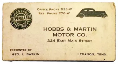
- Invest in Quality Material and Printing
Do: Invest in high-quality cardstock and professional printing services. A well-printed card with vivid colors and sharp imagery is a reflection of your travel agency's dedication to quality.
Don't: Don't compromise on printing quality. A cheap, poorly printed card can create a negative impression.
The Don'ts
- Overly Complex Design
Don't: Avoid overly complex and intricate designs. Your card should be easy to read and understand.
Do: Keep the design simple and clean, focusing on essential information and visuals.
- Low-Quality Imagery
Don't: Use low-quality, pixelated, or stretched images
February 17, 2024
|
View: 1204
|
Categories: Graphic Design, Visiting card designs, Business card Designs, Business card Designs, Visiting card design, Travel Agent visiting card
|
Tags: Visiting card design, Business card, Startup, Creative design, Office Stationery design, Travel
|
By: Printasia
|
Modify By: Mitzijoulge at June 29, 2024
About the Author

Related Posts
Flourishing from the centuries now….
December 13, 2022| Posted in Graphic Design, Visiting card designs, Advocate, Business card Designs, astrologer , Insurance Advisor, Business card Designs, Real Estate, Medical Store, Pharmacy , Hardware business, Visiting card design, Dentist, Accountant visiting card, Chartered Accountant visiting card, CMA Visiting card, Eye specialist visiting card, LIC Agent visiting card, Physiotherapist visiting card, Travel Agent visiting card, Physician Doctor visiting card | Printasia| 1227
History of business card
January 5, 2023| Posted in Visiting card designs, Business card Designs, Business card Designs, Visiting card design| Printasia| 1637
How to design a business card
January 5, 2023| Posted in Graphic Design, Visiting card designs, Advocate, Business card Designs, astrologer , Insurance Advisor, Business card Designs, Real Estate, Medical Store, Pharmacy , Hardware business, Dentist, Accountant visiting card, Chartered Accountant visiting card, Company secretary visiting card, CMA Visiting card, Eye specialist visiting card| Printasia| 1167
The latest trend in business card designs
January 6, 2023| Posted in Graphic Design, Visiting card designs, Advocate, Business card Designs, astrologer , Insurance Advisor, Business card Designs, Real Estate, Medical Store, Pharmacy , Hardware business, Visiting card design, Dentist, Accountant visiting card, Chartered Accountant visiting card, Company secretary visiting card, CMA Visiting card, Eye specialist visiting card, LIC Agent visiting card, Physiotherapist visiting card, Travel Agent visiting card, Physician Doctor visiting card | Printasia| 2215

Visiting Card Importance for Advocate
January 19, 2023| Posted in Graphic Design, Visiting card designs, Advocate, Business card Designs, Business card Designs, Visiting card design| Printasia| 2550
The Complete Guide to Designing an Effective Advocate Visiting Card
November 4, 2023

Growing an Advocate Practice: A Guide to Success
January 31, 2023
Top Beauty Parlour Visiting Card Designs
June 16, 2025
Gold & Diamond Jewellery Visiting Card Layouts
June 14, 2025
Jewellery Visiting Card Designs That Stand Out
June 12, 2025