The Balance of Branding: Infusing Your Makeup Portfolio into Your Visiting Card
The Balance of Branding: Infusing Your Makeup Portfolio into Your Visiting Card
In the world of makeup artistry, where creativity and personal branding are paramount, a makeup artist's visiting card is not just a contact card; it's an extension of your identity and a representation of your art. Your visiting card should encapsulate your signature style, artistry, and professionalism, making a lasting impression on potential clients. In this blog, we will explore the importance of personal branding for makeup artists and how to infuse your makeup portfolio into your visiting card to create a powerful and memorable statement of your craft.
The Significance of Personal Branding for Makeup Artists
Personal branding is the art of creating a unique identity for yourself in the professional world. As a makeup artist, your brand is your professional identity. It encompasses your skills, style, personality, and the experience you offer to your clients. Building a strong personal brand can:
- Set You Apart: In a competitive industry, a distinctive personal brand helps you stand out among other makeup artists.
- Attract the Right Clients: Your brand helps you attract clients who resonate with your style and values.
- Establish Trust: A strong personal brand conveys professionalism and expertise, instilling trust in potential clients.
- Foster Loyalty: Clients who connect with your brand are more likely to become repeat customers and advocates for your services.
Your makeup artist visiting card portfolio is a visual representation of your brand. It showcases your creativity, expertise, and the range of looks you can create. By infusing your portfolio into your visiting card, you can create a seamless and memorable extension of your brand.
Let's explore how to strike the right balance and infuse your makeup portfolio into your visiting card effectively:
- Selecting the Right Portfolio Images
Your makeup portfolio likely contains a wide range of images showcasing different styles, themes, and techniques. To infuse your visiting card with your portfolio, you need to curate the right selection of images that encapsulate your style and versatility.
Technique: Start by reviewing your portfolio and selecting a set of images that represent the diverse looks you can create. Ensure that the images are high-quality, well-lit, and professionally shot.
Advice: The number of images you select should be appropriate for the size of your visiting card. A collage of 4-6 images or a single striking image that conveys your style can work well.
- Designing Your Makeup Artist Visiting Card Layout
The layout of your visiting card is crucial in integrating your portfolio. It should create a harmonious visual flow and not overwhelm the card with images. Here are two layout options:
- Collage Layout
- Technique: Arrange the selected images in a visually appealing collage format. Ensure that the layout is balanced and does not appear cluttered.
- Advice: Add your logo or business name at the top or bottom, and include your contact information on the reverse side of the card to maintain a clean and elegant front layout.
- Single Striking Image Layout
- Technique: Choose a single, striking image from your portfolio that exemplifies your style. This image should encapsulate the essence of your artistry.
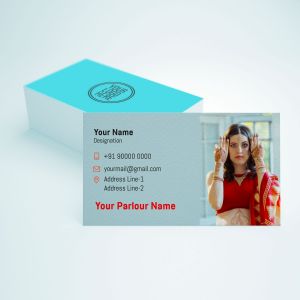
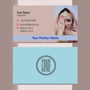
- Advice: Place the selected image on the front side of the card. Keep the design minimal with your name, title, and contact details discreetly placed on the card.
- Typography and Brand Elements
The typography and overall design should complement your brand and the makeup portfolio you're showcasing. Ensure that your name and other text elements do not distract from the images but rather enhance the visual appeal.
Technique: Choose fonts and typography styles that align with your brand. If your style is bold and dramatic, opt for bold fonts. For a soft and natural style, use elegant and flowing fonts.
Advice: Maintain consistency in typography and design across all your branding materials, from your makeup artist visiting card to your website and social media profiles.
- Image Placement and Size
The placement and size of the portfolio images are pivotal in creating an effective visiting card. They should be strategically positioned to create a visual impact.
Technique: In a collage layout, ensure that the images are equally sized and positioned in a way that complements your overall design. In a single striking image layout, make sure the image is the central focus and covers a significant portion of the card.
Advice: The images should be vibrant and captivating, evoking a desire to explore your makeup artistry further.
- Color Palette
The color palette you choose for your visiting card should align with your brand and the makeup styles you specialize in. It should create a visually cohesive look.
Technique: Select colors that resonate with your brand identity and the emotions you want to evoke. Bright and vibrant colors can portray creativity, while neutral colors can convey sophistication.
Advice: Maintain consistency in your color palette across all your branding materials to ensure that your brand identity remains intact.
- Logo Integration
If you have a logo, consider incorporating it into the design. Your logo should be well-integrated into the overall aesthetic, enhancing your brand's recognition.
Technique: Place your logo strategically, either at the top or bottom of the card, ensuring that it doesn't overpower the images or the overall design.
Advice: Make sure your logo design is consistent with your brand identity, and the color scheme complements the card's overall look.
- Aesthetic Details and Borders
Aesthetic details, such as borders, frames, or patterns, can enhance the design of your visiting card, adding a touch of sophistication and style.
Technique: Experiment with different aesthetic details that align with your brand and the makeup styles you showcase. For example, if you specialize in vintage makeup, consider adding a vintage border to your card.
Advice: Aesthetic details should enhance the overall makeup artist visiting card design without overwhelming it. They should align with your brand.
- Versatility of the Design
Your visiting card should be versatile enough to work in various settings and with different clients. While infusing your portfolio, consider the adaptability of the design.
