Making the Ideal Visiting Card for Makeup Artists: Advice and Techniques
Making the Ideal Visiting Card for Makeup Artists: Advice and Techniques
In the realm of beauty and cosmetics, the artistry of makeup has become a thriving industry, with makeup artists at the forefront. Makeup artists are not just beauty enhancers but are also entrepreneurs and professionals with unique skills to showcase. One essential tool for any makeup artist is the visiting card. In this blog, we will delve into the world of makeup artist visiting card design, offering advice and techniques to help you create the ideal visiting card that reflects your artistry, professionalism, and style.
The Significance of a Makeup Artist's Visiting Card
A makeup artist's visiting card is not just a piece of paper; it's a powerful representation of your artistry and brand. It serves several important functions:
- First Impressions: Your visiting card is often the first impression potential clients have of your work and your personality.
- Professionalism: A well-designed card conveys professionalism and trustworthiness, indicating that you are a skilled and reliable makeup artist.
- Memorability: An eye-catching card is more likely to be retained by clients, helping them remember your services and contact you for future projects.
- Brand Identity: Your card should be an extension of your brand identity, reflecting your unique style and the services you offer.
- Differentiation: A well-crafted visiting card sets you apart from other makeup artists and leaves a lasting impression.
Now, let's explore the techniques and advice for creating the perfect makeup artist visiting card:
- Showcase Your Artistry Through Imagery
As a makeup artist, your work is visual, and the best way to showcase it is through imagery. Include high-quality images of your makeup artistry on your visiting card. This could be a collage of different makeup looks you've created or a striking image that represents your signature style.
Technique: Ensure that the images are high-resolution, well-lit, and of professional quality. They should accurately represent your makeup skills and style. Consider hiring a photographer to capture your best work.
Advice: Rotate the images on your visiting card periodically to keep it fresh and showcase a variety of your work. Choose images that reflect the diversity of makeup styles you can create.
- Professional Branding and Logo
Your visiting card should reflect your professional identity. To achieve this, consider incorporating your personal or business logo, if you have one. If not, consider designing one to enhance your brand identity.
Technique: Develop a logo that is unique to your style and the services you offer. Use professional design software or hire a graphic designer for this purpose.
Advice: Ensure your logo aligns with your overall brand identity. It should be simple, memorable, and relevant to the beauty and makeup industry.
- Elegant Typography
The choice of fonts and typography on your visiting card is crucial. It should be in line with your brand identity, easy to read, and visually appealing.
Technique: Select fonts that resonate with your brand's style. For an elegant look, consider using serif fonts. Sans-serif fonts may work for a more modern and sleek style. Choose a font pairing that complements each other.
Advice: Maintain consistency in typography across all your branding materials, from the visiting card to your website and promotional materials.
- Personal Information
The basic personal information that you should include on your visiting card includes your name, title (makeup artist), phone number, email address, and website if applicable.
Technique: Make sure this information is clear and easy to read. Use a font size that's legible but not overwhelming. You can use different font styles for your name and contact details to create a visual hierarchy.
Advice: Be sure that your contact information is up-to-date and regularly checked. If you have social media profiles relevant to your work, consider including them as well.
- Finish and Texture
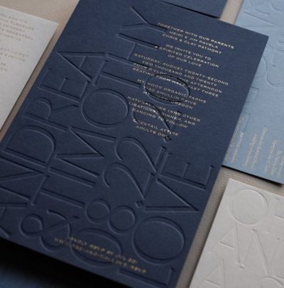
The tactile experience of your visiting card can leave a strong impression. Consider the finish and texture of the card stock.
Technique: Experiment with different types of card stock, finishes, and textures. You can opt for matte, glossy, or textured finishes to achieve the desired effect.
Advice: Choose a finish and texture that align with your brand. For instance, a matte finish can create a sleek and modern look, while textured card stock can add a touch of elegance.
- Color Palette
Colors play a crucial role in creating the mood and style of your visiting card. The color palette you choose should align with your brand identity and the emotions you want to evoke in potential clients.
Technique: Select a color palette that reflects your signature style as a makeup artist. Bright and vibrant colors can portray a sense of creativity and fun, while neutral colors can convey sophistication and professionalism.
Advice: Be consistent with your color palette across all your branding materials, from your visiting card to your website, social media, and promotional materials.
- Aesthetic Details
A few well-placed aesthetic details can elevate the design of your visiting card. Consider using elements like borders, frames, or patterns to add a touch of sophistication.
Technique: Experiment with different aesthetic details to find what works best for your brand. Borders can create a structured and organized look, while patterns can add a playful or elegant touch.
Advice: Keep aesthetic details subtle and balanced. They should enhance the overall design without overwhelming it.
- Call to Action
Your visiting card should not only provide contact information but also encourage potential clients to take action.
Technique: Include a subtle call to action, such as "Book Your Makeup Session Today" or "Visit Our Website for More Looks."
Advice: Make your call to action clear and specific, guiding potential clients on the next steps they should take to connect with you or explore your services.
- Social Media Integration
In today's digital age, your online presence is just as important as your physical presence. Integrating your social media handles on your visiting card can help potential clients connect with you online.
Technique: Include icons or symbols of social media platforms, such as Instagram, Facebook, or YouTube, along with your handles or links.
Advice: Make sure your social media profiles are consistently


