LIC Visiting Card Design Trends: Staying Ahead in the Insurance Industry
In the ever-evolving world of insurance, making a strong first impression and establishing trust with potential clients is essential. Your LIC (Life Insurance Corporation) visiting card is often the first tangible point of contact, and its design can significantly impact how you are perceived. To stay ahead in the insurance industry, it's crucial to keep up with the latest visiting card design trends and incorporate innovative ideas. In this blog, we'll explore the current LIC visiting card design trends and provide you with a wealth of ideas for creating insurance business cards that leave a lasting mark.
The Significance of a Well-Designed LIC Visiting Card
Before we delve into the latest design trends, let's underscore the importance of a well-designed LIC visiting card in the insurance industry:
- Professionalism: A professionally designed card sends a message that you are a competent and trustworthy insurance agent. It reflects the seriousness with which you take your role.
- Memorability: A memorable card is more likely to be retained and shared. When clients have your card readily accessible, it makes it easier for them to refer your services to others.
- Credibility: A well-crafted card enhances your credibility and the perception of your expertise. It conveys that you are detail-oriented and committed to your profession.
- Networking Tool: Insurance agents interact with various people, from clients to colleagues. An effective visiting card is a practical networking tool that enables you to share contact information easily.
Staying Ahead with LIC Visiting Card Design Trends
To stay ahead in the insurance industry, it's essential to adopt contemporary design trends that resonate with your target audience. Here are some of the latest trends in LIC visiting card design:
1. Minimalistic Design
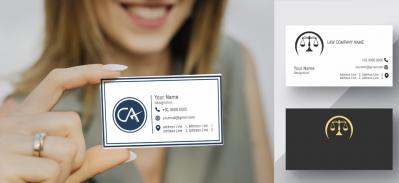
Minimalism is a design trend that's gaining popularity across industries, including insurance. A minimalist LIC visiting card uses clean lines, simple typography, and a limited color palette. This trend signifies simplicity, elegance, and a focus on essential information.
2. Smart Use of Color
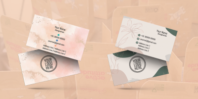
Contemporary LIC visiting cards often employ a strategic use of color. This involves selecting a primary color that reflects your brand identity and one or two complementary colors for highlights. The right color choices can evoke the desired emotions and leave a lasting impression.
3. Digital Integration
Incorporating QR codes on your LIC visiting card is a forward-thinking approach. QR codes can link to your website, social media profiles, or even a downloadable vCard, making it easier for clients to connect with you digitally. This shows that you're tech-savvy and forward-looking.
4. High-Quality Printing and Paper
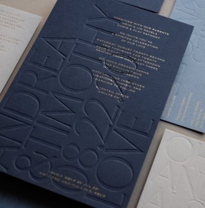
In the digital age, the tactile quality of a card can make a significant impact. High-quality printing and paper stock provides a more substantial, luxurious feel to your card. A soft-touch matte finish is particularly popular as it conveys professionalism and sophistication.
5. Typography Choices
Modern LIC visiting cards often feature creative typography. Bold fonts can make your name and designation stand out, while a classic, easy-to-read font is used for other details. Typography is a critical element in setting the overall tone of your card.
6. Iconography
The use of icons is a trend that enhances the visual appeal and comprehensibility of your card. Icons can represent key elements like phone numbers, emails, and social media, making it easier for recipients to identify and use the information.
Innovative Ideas for Insurance Business Cards
Beyond the design trends, here are some innovative ideas to consider when designing your LIC visiting card:
1. Personal Branding
Invest in personal branding by creating a distinctive logo or emblem. Your logo can be a visual representation of your values, mission, or specialization in the insurance industry.
2. Client Testimonials
Include a client testimonial on the back of your card. This adds authenticity and can reassure potential clients of your expertise and reliability.
3. Interactive Elements
Consider adding interactive elements to your card, like a scratch-off area that reveals a special offer or a magnetic strip with key information. Such elements can set your card apart from the rest.
4. Custom Shapes
Explore custom shapes for your LIC visiting card. Instead of the traditional rectangle, consider a die-cut card in the shape of an umbrella, a house, or another symbol associated with insurance. This can be a memorable touch.
5. Multi-Function Cards
Create a multi-function LIC visiting card by incorporating a detachable portion that can serve as a discount coupon or appointment reminder. This adds utility to your card and increases its chances of being retained.
6. Material Innovation
Experiment with innovative materials for your cards. Consider transparent plastic cards, wood, metal, or even eco-friendly materials like recycled paper.
Conclusion
Your LIC visiting card is a critical tool in your arsenal for success in the insurance industry. By staying ahead of design trends and embracing innovative ideas, you can create a visiting card that not only makes a lasting impression but also sets you apart as a forward-thinking insurance professional. Remember that your card is a reflection of your professionalism, so investing in its design and quality can yield significant returns in the form of client trust, referrals, and success in your insurance career.


