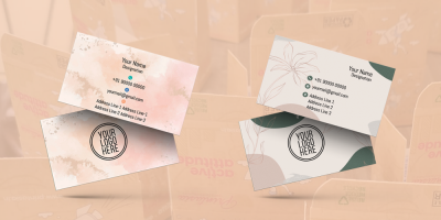
First Impressions Matter: Making a Lasting Impact with Your Makeup Artist Visiting Card
First Impressions Matter: Making a Lasting Impact with Your Makeup Artist Visiting Card
In the world of beauty and the ever-evolving beauty industry, the first impression holds a special place of significance. Makeup artists, as part of this dynamic industry, understand the power of transformation and the magic of a first impression. One of the tools that wield this power is the makeup artist's visiting card. In this blog, we'll explore the art and importance of creating a memorable makeup artist visiting card that leaves a lasting impact.
The Significance of a Makeup Artist's Visiting Card
A makeup artist's visiting card is not just a piece of paper with contact details; it's a mini canvas that carries your brand, style, and professionalism. Here's why it's so significant:
- First Impressions: Your visiting card is often the first tangible impression potential clients have of your work and your personality.
- Professionalism: A well-designed card conveys professionalism and trustworthiness, indicating that you are a skilled and reliable makeup artist.
- Memorability: An eye-catching card is more likely to be retained by clients, helping them remember your services and contact you for future projects.
- Brand Identity: Your card should be an extension of your brand identity, reflecting your unique style and the services you offer.
- Differentiation: In a competitive industry, a well-crafted visiting card sets you apart from other makeup artists and leaves a lasting impression.
Now, let's explore the techniques and advice for creating a makeup artist visiting card that makes a memorable impact:
- High-Quality Imagery
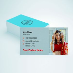
As a makeup artist, your work is inherently visual. The best way to showcase your skills and style is through high-quality imagery. Incorporate images of your makeup artistry on your visiting card to give potential clients a glimpse of your talents.
Technique: Include a collage of high-quality images showcasing different styles and looks you've created. Ensure that the images are well-lit, high-resolution, and professionally shot.
Advice: Rotate the images on your visiting card periodically to keep it fresh and showcase a variety of your work. Choose images that represent your versatility as a makeup artist.
- Reflect Your Brand Identity
The design of your visiting card should reflect your brand identity, including your unique style, niche, and personality as a makeup artist.
Technique: Incorporate your personal or business logo, which should align with your overall brand identity. Use design elements such as color schemes and fonts that are consistent with your brand.
Advice: Ensure that the design choices you make match the specific niche or style of makeup you specialize in. Whether it's bridal, editorial, special effects, or any other style, your card should give potential clients a sense of what to expect.
- Typography That Speaks Volumes
The choice of fonts and typography on your visiting card is crucial. It should be in line with your brand identity, easy to read, and visually appealing.
Technique: Select fonts that resonate with your brand's style. For example, if you have a glamorous and bold brand, consider using elegant, cursive fonts. If your brand is more modern and minimalistic, opt for clean and sleek fonts.
Advice: Maintain consistency in typography across all your branding materials, from the visiting card to your website and promotional materials. Your name, title, and contact information should be clear and easy to read.
- Contact Information
While focusing on aesthetics, don't overlook the practicality of your visiting card. It should provide clear and accessible contact information.
Technique: Include your name, title (makeup artist), phone number, email address, and any other relevant contact details. Use a font size that's legible but not overwhelming.
Advice: Ensure that your contact information is up-to-date and regularly checked. If you have active social media profiles related to your work, consider including them on the card.
- Finish and Texture
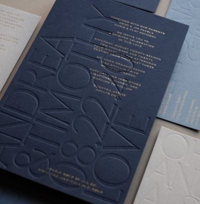
The tactile experience of your visiting card can leave a strong impression. Consider the finish and texture of the card stock.
Technique: Experiment with different types of card stock, finishes, and textures. You can opt for matte, glossy, or textured finishes to achieve the desired effect.
Advice: Choose a finish and texture that aligns with your brand. For instance, a matte finish can create a sleek and modern look, while textured card stock can add a touch of elegance.
- Color Palette
Colors play a significant role in creating the mood and style of your visiting card. The color palette you choose should align with your brand identity and the emotions you want to evoke in potential clients.
Technique: Select colors that resonate with your brand identity and the makeup styles you specialize in. Bright and vibrant colors can portray creativity and fun, while neutral colors can convey sophistication.
Advice: Maintain consistency in your color palette across all your branding materials, from your visiting card to your website, social media, and promotional materials.
- Image Placement and Size
The placement and size of the imagery are pivotal in creating an effective visiting card. They should be strategically positioned to create a visual impact.
Technique: In a collage layout, ensure that the images are equally sized and positioned in a way that complements your overall design. In a single striking image layout, make sure the image is the central focus and covers a significant portion of the card.
Advice: The images should be vibrant and captivating, evoking a desire to explore your makeup artistry further. Avoid overcrowding the card with images; each image should have space to breathe.
- Aesthetic Details and Borders
Aesthetic details, such as borders, frames, or patterns, can enhance the design of your visiting card, adding a touch of sophistication.
Technique: Experiment with different aesthetic details to find what works best for your brand. Borders can create a structured and organized look, while patterns can add a playful or elegant touch.
Advice: Keep aesthetic details subtle and balanced. They should enhance the overall design without overwhelming it.
