Designing the Perfect Jyotish Astrology Visiting Card: Tips and Trends
Designing the Perfect Jyotish Astrology Visiting Card: Tips and Trends
In the world of Jyotish astrology, where cosmic forces and ancient wisdom meet, the first impression is often the most significant. A well-crafted Jyotish astrology visiting card can be your gateway to creating that impactful first impression and establishing trust with your clients. It serves as a tangible representation of your expertise, values, and the wisdom you bring to your practice. In this blog, we'll explore the art of designing the perfect Jyotish astrology visiting card, offering valuable tips and insights to help you create a memorable business card that resonates with your clients.
Designing an Impressive Jyotish Astrology Visiting Card
Your Jyotish astrology visiting card should be more than just a piece of paper with contact information; it should encapsulate the essence of your practice and the cosmic wisdom you bring to your clients. Here are some tips to design an impressive Jyotish astrology visiting card:
- Balancing Tradition and Modernity: Jyotish astrology has deep roots in tradition and ancient wisdom. While embracing this heritage, ensure your card design also incorporates modern aesthetics. Use traditional symbols or imagery but present them in a contemporary and professional manner.
- Quality Paper and Printing: Invest in high-quality paper and professional printing. The tactile experience of holding a well-crafted card adds to its overall impact and conveys the importance and seriousness of your practice.
- Clear and Legible Fonts: Use fonts that are easy to read. While artistic calligraphy may be appealing, readability should be a top priority. The text on your card should be easily understood, as clarity reflects professionalism.
- Incorporate Your Brand Colors: If you have specific brand colors associated with your Jyotish astrology practice, incorporate them into the card's design. Consistency in color schemes strengthens brand recognition and reinforces your identity.
- Celestial Elements: Given the cosmic nature of Jyotish astrology, consider incorporating celestial elements, such as stars, planets, or constellations, into the design. These elements reinforce the connection to astrology and the mysteries of the cosmos.
- Aesthetic Symmetry: Create a balanced and symmetrical design. Visual harmony and order in the card's layout can be reflective of the order and precision inherent in astrology.
- Use of Space: Make efficient use of both sides of the card. The front can feature your name, title, and contact information, while the back can include a brief bio, testimonials, or a QR code linking to your website.
- Colors with Purpose: The color palette you choose should align with the emotions and feelings you want to evoke. Blues and purples, for example, are often associated with spirituality and intuition.
- Typography: Choose fonts that evoke a sense of wisdom and mystique. Script or calligraphic fonts can be a good choice, but ensure they remain legible. The typography should enhance the overall aesthetics.
- Quality Images: If you decide to include images or illustrations, ensure they are of high quality and relevant to Jyotish astrology. Blurry or pixelated images can detract from the overall impact.
Key Elements for a Successful Astrology Visiting Card
To create a successful Jyotish astrology visiting card, certain key elements should be incorporated into its design and content. These elements help convey the essence of your practice and your approach to astrology:
- Your Name and Credentials: The primary purpose of your visiting card is to introduce you. Include your name and any relevant credentials or titles that establish your expertise.
- Tagline or Motto: A succinct tagline or motto can provide a glimpse of your approach to astrology. It serves as a quick reference point for potential clients, offering a hint of what they can expect from your services.
- Contact Information: Include your phone number, email address, and physical location if you have one. Ensure that all contact information is accurate and up-to-date.
- A Brief Introduction: A concise introduction on the card can further explain your practice and the specific areas of astrology you specialize in. For example, "Vedic Astrologer with Expertise in Natal Charts."
- Testimonials: If you've received positive feedback from clients, consider including a brief testimonial on the back of your card. Genuine testimonials can enhance your credibility and create a sense of trust.
- Professional Photo: Including a professional headshot on your card humanizes your practice and creates a personal connection with potential clients. It adds a face to the expertise, making you more approachable.
- QR Code: A QR code can link to your website, blog, or portfolio of your work, making it convenient for clients to access more information about your practice and the services you offer.
- Social Media Information: If you are active on social media platforms and use them to share astrological insights or connect with clients, include the relevant icons or links on your card.
- Specialization or Niche: If you specialize in a specific area of astrology, such as natal chart analysis, relationship compatibility, or career guidance, highlight it on your card. This clarity can help clients understand your unique offerings.
- Authentic Signature: Consider including an authentic signature or seal, if applicable, as a personal touch that signifies your commitment to authenticity and tradition.
Trends in Jyotish Astrology Visiting Card Design
The world of design is constantly evolving, and visiting card trends in the field of Jyotish astrology are no exception. To ensure your card remains relevant and appealing, consider the following design trends:
- Minimalism: Minimalistic design continues to be a popular trend. Clean, uncluttered layouts with ample white space convey a sense of simplicity and elegance. This approach allows key information to shine and ensures a memorable design.
- Custom Shapes: Standard rectangular cards are giving way to custom shapes. Consider a card in the shape of a celestial object, such as a star or a crescent moon, to align with your astrology practice.
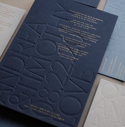
- Texture and Embossing: The use of textured paper or embossed elements can add a tactile dimension to your card. This creates a sense of depth and substance that enhances the overall experience of holding your card.
- Sustainability: Eco-friendly materials and printing processes are becoming increasingly popular. A commitment to sustainability not only reflects well on your practice but also appeals to clients who value environmental responsibility.
- Handwritten Elements: Handwritten elements, such as your signature or a brief note, can add a personal and authentic touch to your card. This trend humanizes the design and strengthens the connection with clients.
- Color Psychology: A thoughtful selection of colors, in alignment with the principles of color psychology, can evoke specific emotions and feelings. Use colors that resonate with the spiritual and emotional aspects of astrology.


