Designing Distinction: Company Secretary Visiting Card Ideas
Designing Distinction: Company Secretary Visiting Card Ideas
In the fast-paced world of business, where first impressions can make or break a deal, the importance of a well-designed visiting card cannot be overstated. As a company secretary, your visiting card is not just a piece of paper with contact information; it's a powerful tool for branding and establishing your professional identity. In this blog, we'll explore some creative and distinctive company secretary visiting card ideas to help you make a lasting impression and set yourself apart in the business world.
The Role of a Company Secretary in Branding
Before we dive into visiting card design ideas, let's first understand the significant role a company secretary plays in branding. A company secretary is responsible for ensuring that an organization complies with legal and regulatory requirements. They are the guardians of corporate governance, ensuring that the company operates within the bounds of the law. In this context, the company secretary's branding and professional image must reflect precision, trustworthiness, and expertise.
A company secretary's visiting card is a tangible representation of their professional identity and the organization's image. When someone receives your visiting card, it should immediately communicate your brand values and the professionalism you bring to the table. Now, let's explore some distinctive visiting card design ideas that can help you achieve this.
- Minimalistic Elegance
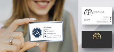
Minimalism is a design approach that focuses on simplicity and the use of minimal elements. For a company secretary's visiting card, this can translate to a clean and elegant design. Consider a simple white or cream-colored card with your name and title in a classic, easy-to-read font. This design choice emphasizes professionalism and makes a strong first impression.
A touch of gold or silver foil for your name, title, or logo can add a touch of sophistication. The contrast between the understated background and the metallic accents creates a sense of exclusivity and importance.
- High-Quality Paper and Texture
The choice of paper and texture can have a significant impact on the perceived quality of your visiting card. Opt for a thicker, premium cardstock that not only feels substantial in hand but also adds a sense of reliability to your professional image. Consider adding a subtle texture to the card, such as a linen finish, to give it a tactile dimension that engages the senses.
- Subtle Embossing
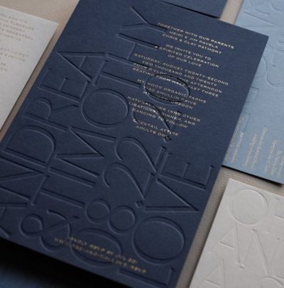
Embossing is a technique that raises certain parts of your card design, creating a tactile experience. Consider having your company's logo or your name embossed on the card. This not only adds a touch of elegance but also provides a distinct textural element that makes your card stand out.
- Unique Die-Cut Shapes
Most visiting cards are rectangular, but a unique die-cut shape can set yours apart from the rest. Explore different geometric shapes or custom shapes that resonate with your brand or industry. A round card, for instance, can symbolize unity and completeness, while a hexagonal card can symbolize efficiency and precision. The choice of shape can convey a subtle message about your company's values.
- Use of Spot UV Coating
Spot UV coating is a printing technique that adds a glossy, reflective layer to specific parts of your card design. This technique can be used to highlight your logo, name, or any other design elements you want to emphasize. The contrast between the matte cardstock and the shiny spot UV coating creates an eye-catching effect that draws attention to the most important parts of your card.
- Incorporating Corporate Colors
Your company's branding likely includes specific colors that represent your organization. Integrating these colors into your visiting card design is a great way to reinforce your corporate identity. The color palette you choose can also convey certain emotions or associations. For example, blue can symbolize trust and reliability, while green can represent growth and sustainability.
- Foil Stamping
Foil stamping is a technique that applies a thin layer of metallic foil to specific areas of your card. It creates a stunning, reflective effect that adds a touch of luxury to your card. Gold and silver foils are popular choices for a classic and sophisticated look, while other colors can be used for a more unique and distinctive appearance.
- Custom Illustrations or Artwork
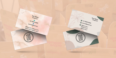
Consider incorporating custom illustrations or artwork that align with your company's values or industry. This adds a personal touch to your card and can serve as a conversation starter. For example, if you work in the environmental sector, a card with a botanical illustration can convey your commitment to sustainability.
- QR Code Integration
Incorporating a QR code on your visiting card can make it easier for people to connect with you online. The QR code can link to your LinkedIn profile, your company's website, or other relevant online resources. This not only adds a modern touch to your card but also makes it more functional in the digital age.
- Typography as a Focal Point
Typography can be a powerful design element. Consider using bold and distinctive fonts for your name and title to make them the focal point of your card. The choice of typography can convey a sense of authority and professionalism.
- Professional Photography
Including a professional headshot on your visiting card can help establish a personal connection with clients and stakeholders. It humanizes your role as a company secretary and makes you more relatable. Ensure that the photo is of high quality and professionally taken.
- Information Hierarchy
Ensure that the most critical information is presented clearly and prominently. Your name, title, and contact information should be easy to find and read. The use of a grid layout can help create a structured hierarchy that guides the reader's attention.
- Legal Disclaimer
Given the legal and regulatory nature of your role, consider including a brief legal disclaimer on your card. This can reassure clients and stakeholders of your commitment to adhering to all legal and ethical standards.
- Tagline or Slogan
A well-crafted tagline or slogan can succinctly convey your company's values and mission. It can provide an instant understanding of your commitment to ethical business practices and corporate governance.
- Eco-Friendly Design
If your company values sustainability, consider using eco-friendly materials for your visiting card. Recycled paper or sustainable inks can demonstrate your commitment to environmental responsibility.
Conclusion
Designing a distinctive visiting card as a company secretary is not just about providing contact information; it's an opportunity to convey your brand's values and professionalism. The design elements you choose, from paper quality to unique shapes, can set you apart in the competitive world of business. By carefully considering each design element and how it aligns with your brand's image, you can create a visiting card that leaves a lasting impression and helps you stand out as a company secretary. Remember, in the world of business, it's the little details that often make the biggest difference.


