Crafting the Perfect Event Company Visiting Card: Key Elements to Consider
Crafting the Perfect Event Company Visiting Card: Key Elements to Consider
In the dynamic and creative world of event planning and management, every detail matters, and first impressions are paramount. The event company visiting card is not just a piece of paper; it's a powerful tool that can leave a lasting impression on potential clients, partners, and attendees. To create the perfect event company visiting card, there are key elements that need to be considered, from design to branding. In this blog, we will explore these elements to help you craft the ideal event business card that leaves a memorable mark.
The Significance of Event Company Visiting Cards
Event company visiting cards play a pivotal role in the world of event planning and management. They serve multiple functions and hold great importance for the following reasons:
- First Impressions: Your visiting card is often the first point of contact potential clients or collaborators have with your event company. It sets the tone for their perception of your professionalism and creativity.
- Memorability: A well-crafted visiting card is more likely to be retained and remembered, making the recipient more likely to contact you for their event needs.
- Information Hub: Event company visiting cards are a concise information hub, providing essential details about your services, contact information, and branding.
- Brand Image: The design and content of your visiting card reflect your event company's brand image, showcasing your style, creativity, and attention to detail.
Now, let's explore the key elements to consider when crafting the perfect event company visiting card:
- A Well-Defined Brand Identity
Your event company's brand identity should be at the core of your visiting card design. It's the foundation upon which all other elements are built.
Technique: Use your brand colors, fonts, and logo in the card's design. Ensure that the design aligns with the overall style and image your event company wants to portray.
Advice: Consistency in brand identity across all materials helps reinforce brand recognition.
- Clean and Minimalistic Design
Minimalistic design is a popular trend that can create a sense of elegance and sophistication.
Technique: Use a clean layout with ample white space. Employ a simple and easy-to-read font. Avoid clutter and unnecessary design elements.
Advice: Minimalistic designs can be powerful in conveying professionalism and an eye for detail.
- High-Quality Imagery
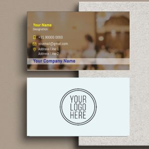
Imagery plays a crucial role in event planning, and incorporating high-quality images can give potential clients a glimpse of your capabilities.
Technique: Use images of events you've organized that reflect your expertise and style. Ensure the images are high-resolution and well-composed.
Advice: High-quality imagery can help clients visualize the kind of events you can create for them.
- Contact Information
The primary function of a visiting card is to provide contact information for potential clients. This should be clear and easily accessible.
Technique: Include your company name, your name (if desired), phone number, email address, and website. You can also add social media handles if they are relevant to your business.
Advice: Organize the information in a logical and easy-to-read format. Make sure the font size is legible.
- Services and Expertise
Clients want to know what services you offer and your areas of expertise. Including this on the visiting card can be beneficial.
Technique: Briefly describe your services or areas of expertise. You can use bullet points or a concise statement to convey this information.
Advice: The goal is to provide enough information to pique the recipient's interest without overwhelming them with details.
- Creative Branding
Event planning and management are about creativity and innovation. Your visiting card should reflect these qualities.
Technique: Use creative design elements or graphics that are relevant to the event industry. Think about using event-related icons, such as balloons, confetti, or even simplified representations of event venues.
Advice: The creative elements should add to the overall aesthetic of the card and reflect your company's style.
- QR Codes for Digital Interaction
QR codes have become a valuable tool for digital interaction. You can use them to link potential clients to your website, portfolio, or even a video showcasing your work.
Technique: Include a QR code on the card that leads to a specific online destination, such as your website or a portfolio page.
Advice: Make sure the content linked by the QR code is relevant and engaging.
- Testimonials or Client Quotes
Client testimonials or quotes can add authenticity and credibility to your visiting card.
Technique: Include a brief, positive client quote or testimonial on the back of the card. You can also add a section for client reviews.
Advice: Make sure the testimonials or quotes are authentic and reflective of the quality of your services.
- Unique Finishing
Consider unique finishing options that make your visiting card stand out.
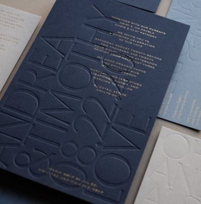
Technique: Add unique finishes like embossing, foiling, spot UV coating, or even letterpress printing. These techniques can add a tactile and visual dimension to your card.
Advice: Unique finishes should complement the overall design and branding of the card.
- Visual Hierarchy and Layout
The layout and visual hierarchy of your visiting card are critical in guiding the recipient's eye through the information.
Technique: Prioritize the most important information, such as your company name and contact details, making them more prominent. Use font size and style to create a visual hierarchy.
Advice: The layout should be easy to follow, with the most crucial details immediately noticeable.
