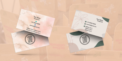
Crafting the Perfect Construction Visiting Card: A Step-by-Step Guide
Crafting the Perfect Construction Visiting Card: A Step-by-Step Guide
In the construction industry, where first impressions and professionalism are paramount, a well-designed visiting card can be a powerful asset. Your construction visiting card is more than just a piece of paper with contact details; it's a representation of your brand, a tool for networking, and a means of building credibility. In this comprehensive guide, we'll walk you through the step-by-step process of crafting the perfect construction visiting card.
Why Your Construction Visiting Card Matters
Before we dive into the process of designing the perfect construction visiting card, let's understand why it's so important in the construction industry:
- First Impressions: Your visiting card is often the first point of contact between you and potential clients or partners. A well-designed card creates a strong and lasting first impression.
- Professionalism: A professionally crafted visiting card reflects the professionalism of your construction company. It conveys that you pay attention to detail and take your business seriously.
- Credibility: A well-structured card with a consistent design boosts your credibility. It reassures potential clients that they can trust your services.
- Contact Information: While design is crucial, the primary function of a visiting card is to provide essential contact information. It makes it easy for potential clients, partners, or associates to reach out to you.
- Networking Tool: Your visiting card serves as a networking tool that can help you connect with peers, subcontractors, and industry professionals. It's a valuable asset in your professional relationships.
Now that we understand the significance of a construction visiting card, let's dive into the step-by-step guide for creating the perfect one.
Step 1: Define Your Brand Identity
Before you start designing your visiting card, it's essential to have a clear understanding of your brand identity. Your brand identity includes elements like your logo, color scheme, typography, and messaging. Consider the following:
- Logo: If you have a company logo, ensure it's high-resolution and clear. Your logo is a central part of your brand identity and should be prominently displayed on your visiting card.
- Color Scheme: Select a color scheme that aligns with your brand. The colors you choose should be consistent with your logo and other marketing materials.
- Typography: Use fonts that complement your brand identity. Typography consistency is vital for maintaining a professional image.
- Messaging: Define the key messaging or tagline that you want to convey through your visiting card. It should encapsulate your brand's essence and value proposition.
Step 2: Determine Key Information
The next step is to determine the key information that you want to include on your visiting card. Here's a checklist of essential details:
- Company Name: Your company name should be prominently displayed.
- Your Name: If you're the primary point of contact, include your name along with your title.
- Contact Information: Include your phone number, email address, and physical address. Ensure that this information is up to date.
- Website: Add your company website if you have one. This is a vital tool for potential clients to learn more about your services and portfolio.
- Social Media Links: If your construction company has a presence on platforms like LinkedIn, Facebook, or Instagram, consider adding icons or links to your profiles.
- Tagline: If you have a tagline or a concise statement that encapsulates your brand identity or value proposition, it can be included.
Step 3: Choose the Right Design
The design of your visiting card is crucial in making it visually appealing and memorable. Consider these design elements:
- Layout: Decide on the layout of your card. Will it be a landscape or portrait orientation? Think about how the elements, such as your logo and contact information, will be arranged.
- Color Palette: Stick to the color scheme that reflects your brand identity. This consistency is vital for maintaining your brand image.
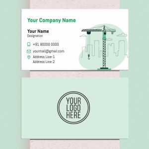
- Images: In the construction industry, images of completed projects can be powerful. Include high-quality, relevant images that showcase your work.
- Typography: Choose legible fonts for your text. Ensure that your typography aligns with your brand identity.
- White Space: Maintain adequate white space to prevent overcrowding and make the card easy to read.
Step 4: Incorporate Brand Elements
Now, it's time to incorporate your brand elements into the design. Ensure that your logo, color scheme, typography, and tagline are integrated seamlessly.
- Logo Placement: Your logo should be placed prominently on the card. It's usually positioned in the top corner, ensuring it's immediately visible.
- Color Usage: Make sure your chosen colors are used in various design elements, such as text, borders, or backgrounds.
- Typography Consistency: Use the same fonts that are part of your brand identity across your visiting card.
Step 5: Add Special Touches
To make your visiting card unique and memorable, consider adding special touches:
- Texture: Experiment with textured paper or finishes to give your card a tactile dimension.
- Die-Cut Shapes: Instead of a standard rectangular card, consider a unique shape that aligns with your brand or services.
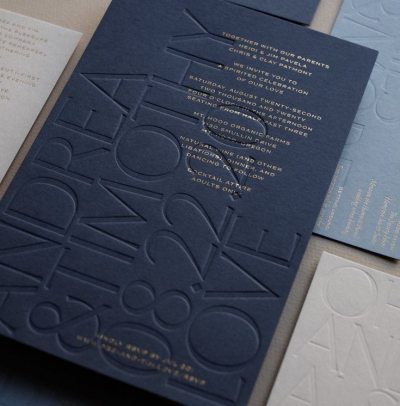
- Embossing: Embossed elements, such as your logo or a tagline, can add a subtle but impactful visual effect.
Step 6: Proofread and Review
Before you send your visiting card for printing, ensure that it's error-free and aligns with your brand identity. Proofread all text, check for accuracy, and review the design for consistency.
Step 7: Printing
Invest in high-quality printing to ensure that your card looks and feels professional. Choose a printing company that can produce sharp, clear images and text.
Step 8: Test and Feedback
Before ordering a large quantity, print a few samples and seek feedback from colleagues or industry peers. They can provide valuable insights and suggestions for improvement.
Step 9: Order and Distribute
Once you're satisfied with the design and quality of your visiting card, place an order for the desired quantity. Distribute your visiting cards at networking events, client meetings, and wherever you have an opportunity to make a professional connection.
Step 10: Consistent Branding
Consistency is key. Ensure that your visiting card aligns with your overall branding, including your website, brochures, and other marketing materials. This consistency reinforces your professional image.
Conclusion
Crafting the perfect construction visiting card is a meticulous process that involves careful consideration of your brand identity, design elements, and the essential information you want to convey. A well-designed visiting card makes a strong first impression, reflects your professionalism, and communicates your brand identity effectively. By following this step-by-step guide, you can create a construction visiting card that leaves a lasting impact and sets the stage for successful client relationships and business growth. Your visiting card is a reflection of your brand, so make it count in every interaction.


